
31st May: Virus assessment (2)
![]() Has the “curve flattened”?
Has the “curve flattened”?
Figure 1 shows the cumulative reported case numbers (per 100k of population) for the “worst” performing countries from the JHU site. This figure was updates with data up to and including Wednesday 27th May. On this plot three countries stand out: the US, the UK, and Sweden. For each of these countries the curve is still rising at an appreciable rate indicating a significant number of new daily cases. In the other countries the number of new cases each day is much smaller.
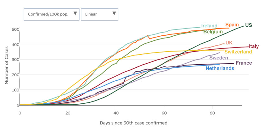
Figure 1. Comparison of cumulative reported cases per 100k of the countries population copied from the JHU web site
How does the UK compare with other similar countries?
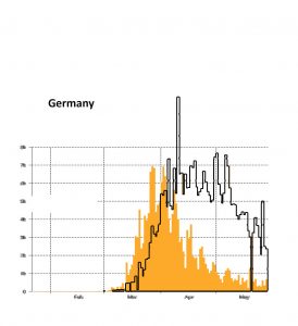
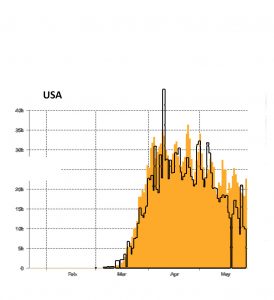
Figure 2 shows plots adapted from the Johns Hopkins University web site for the number of confirmed cases on a daily basis. I’ve chosen five European countries plus the USA countries. The data used goes up to the end of Thursday 28th May. I have stretched or shrunk the plots vertically to adjust for the difference in population between the different countries and the UK. What look like errors in reporting for certain days in France and Spain means I have had to stretch the original JHU graphs quite a lot but the overall shape should be good. I’ve superimposed the outline of the UK data on each of the other countries for comparison. Of course there are differences in the way cases are counted in the different countries so the plots are not strictly comparable. Nevertheless, it seems a consistent story is emerging.
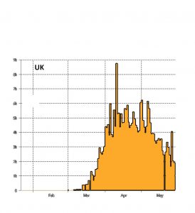

In the UK (Figure 2a) the outbreak started about mid March and the number of daily cases stayed high during April. It is now decreasing and is presently around 2000 new cases every day. Note that these are just confirmed new cases (i.e.people who were tested and found positive).
Based on a survey of a sample of the population taken between 26th April to 24th May the Office of National Statistics suggest that on average there were about 8000 new cases per day (the 95% confidence interval gives a value between 5000 and 12000 new cases per day). If we assume (from Figure 2) that we are now running at about 2/3 of the average figure during the ONS sampling period then at present there are about 5000 new cases every day (95% confidence: 3000 to 8000 per day).
What this indicates is that the levels shown in Figure 2a should be multiplied by a factor of around 2.5 (95% confidence: 1.5 to 4) to reflect the true rate of new infections. However I’ll assume that the counts for other countries is similarly underestimated and leave them all (including the UK) unchanged. What is clear is that the values shown for the UK in Figure 2a are not over estimated.
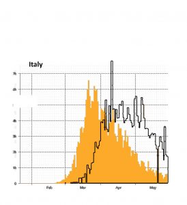
Italy (Figure 2b) has often been quoted as the continental European country that has been most hard hit by the virus. The outbreak started towards the end of February and peaked in mid to late March at levels higher than seen in the UK. However a stringent lockdown was applied and infection rates in Italy have dropped much faster than we have seen in the UK.
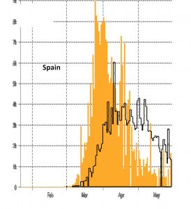
The outbreak in Spain (Figure 2c) was only slightly behind that in Italy. Allowing for the smaller population Spain was much more badly hit than Italy. However, there too a stringent lockdown was applied and, like Italy, the outbreak appears to now be controlled.
The data for France (Figure 2d) shows large fluctuations which must simply reflect the system by which the count of new cases is updated. However, if one visually smooths the data the result (scaled by population, remember) looks quite similar to Germany (Figure 2e). Like Italy and Spain, both France and Germany appear to have the outbreak under control.
Finally for the USA (Figure 2f), when scaled by population, the outbreak is surprisingly similar to the UK. However from mid May onwards the rate of decline in the number of new cases is less than that seen in the UK. This weekend there have been riots in many US cities. It seems likely that Trump will preside over one of the worst coronavirus outbreaks, which is not surprising.
How important are lockdown measures in controlling the outbreak?
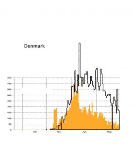
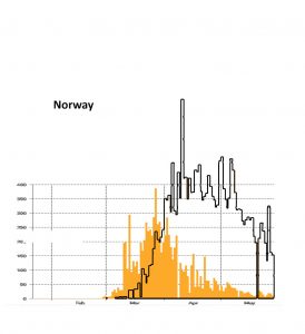
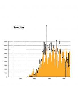
Was it really the lockdown measures that have supressed the outbreak in countries like Spain and Italy or was it something else? For example, perhaps, like flu, the virus outbreak simply dies out in summer? The comparison of Scandinavian countries shown in Figure 3 seems good evidence for the need for a lockdown. Again the diagrams have been scaled according to the country’s population and a black line shows the equivalent values for the UK. In Denmark (Fig. 3a) and Norway (Fig. 3b) they had a lockdown and the outbreak has been controlled. In Sweden (Fig 3c) they told people to take care but did not have a formal lockdown. In Sweden the number of new cases is still at a high level.
Incidentally, the experience in Danish primary schools has been used on UK TV to illustrate how it may be OK for the schools to go back in England from the start of June. Possibly it is, but the incidence of the virus in the population is presently much higher in the UK than in Denmark.
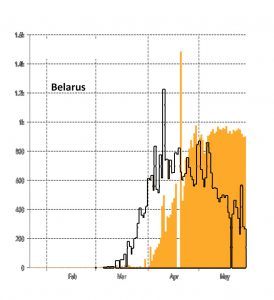
Finally in Belarus we are told that the Government has not taken measures against the virus, although one assumes that the people will have modified their behaviour. The outbreak there didn’t start until April but, after allowing for the population difference, the initial growth rate was similar to that experienced in the UK. However at present the outbreak in Belarus remains at a constant, high level; there is no sign of the outbreak coming under control.