
6th April: Virus Update
![]() So it’s Monday, 6th April, and the Covid-19 virus has us in “lockdown”. We are urged to stay at home but are allowed to leave for essential shopping, medical reasons, local exercise, or unavoidable travel to “essential” work. People over 70 are urged to self-isolate at home. I haven’t been away from the house/garden/boat at jetty since the 19th March when I went for a shortened walk in Riverside Park and picked up a few grocery items at the Bitterne Triangle Co-op. Fortunately Waitrose sent me an email offering me priority on booking a delivery slot because I was an established customer over 70 years old and that was delivered late on Friday (3rd April) afternoon.
So it’s Monday, 6th April, and the Covid-19 virus has us in “lockdown”. We are urged to stay at home but are allowed to leave for essential shopping, medical reasons, local exercise, or unavoidable travel to “essential” work. People over 70 are urged to self-isolate at home. I haven’t been away from the house/garden/boat at jetty since the 19th March when I went for a shortened walk in Riverside Park and picked up a few grocery items at the Bitterne Triangle Co-op. Fortunately Waitrose sent me an email offering me priority on booking a delivery slot because I was an established customer over 70 years old and that was delivered late on Friday (3rd April) afternoon.
 Also on that Friday the Southampton Harbour Master issued a Notice to Mariners concerning Recreational Boating. Some people had said to me that, since I sail single-handed, surely I could still go out sailing, or at least go on the river. But I was nervous of doing so. Ever since I started sailing in the 1960’s I have never got into trouble and needed rescuing; I’ve had gear breakages and unexpected changes in the weather but I’ve always got the boat back. However there is always a first time! In the present circumstances, if things went wrong it could be difficult and embarrassing. Anyway, now I can use the Notice to Mariners to justify to myself my decision to plan on staying ashore!
Meanwhile I’ve been getting more and more frustrated at the standard of journalism in reporting the pandemic. On news report after news report they say how many cases and/or deaths there have been in the last 24 hours for the UK and other countries and whether the numbers have gone up or down. In general this is meaningless information. Sometimes the reporter will say that “experts say you should not look at a single day’s figures” but still they continue to do it! Are there no reporters with enough training to understand statistics and methods of analysis? Today I decided to look at the figures myself.
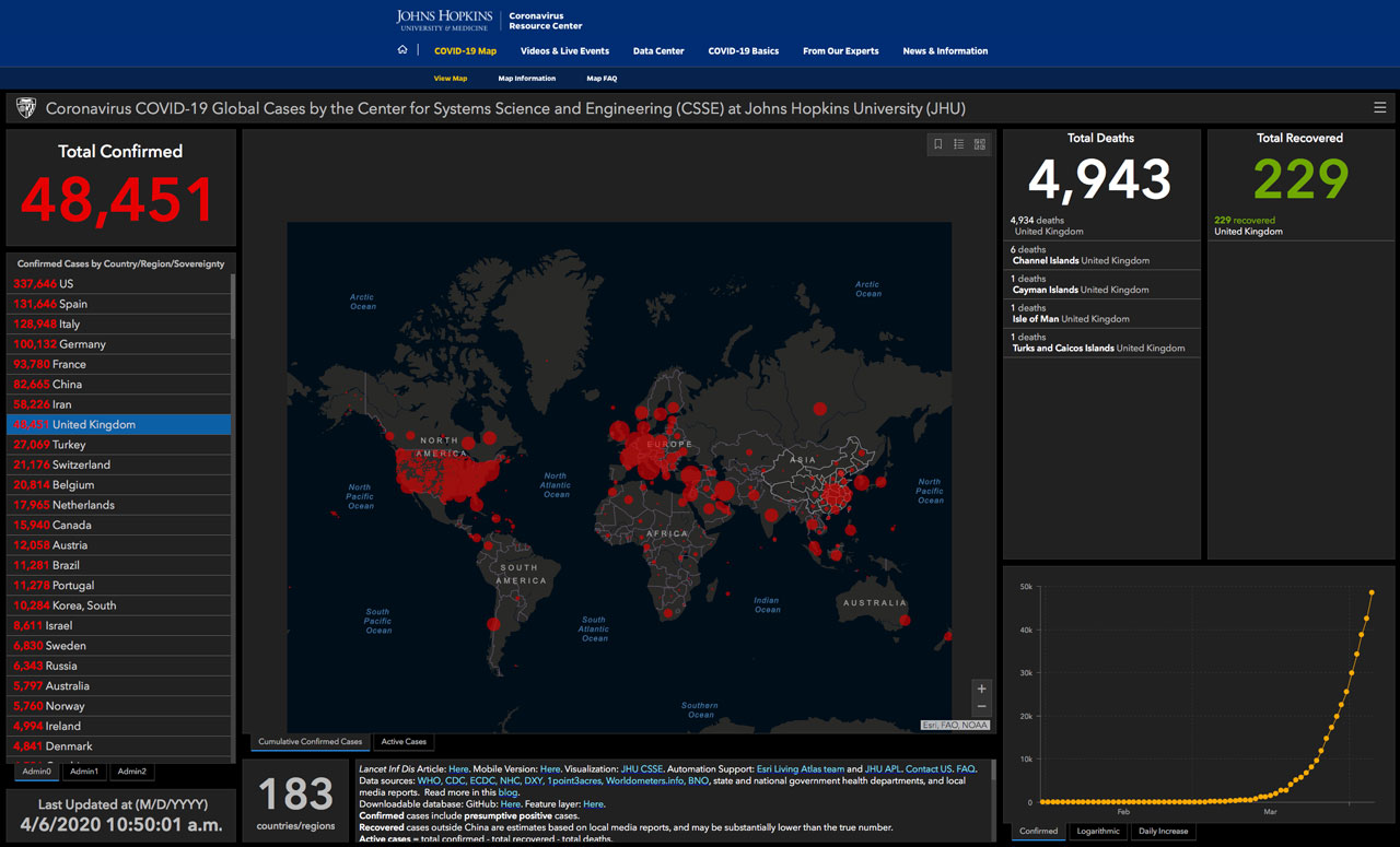 The best source of figures and analysis I’ve found are those from the Johns Hopkins University in Baltimore. An alternative source is the worldmeters web site and I’ve used the information on Coronavirus testing from there ( in fact worldmeters say they are the data source for JHU ). For country by country population numbers (for 2019) I used worldpopulationreview.com, these numbersthere seem similar to those used by the worldmeters site which I found later. The coronavirus data I’ve used were last updated between midnight and 3gmt on 6th April 2020.
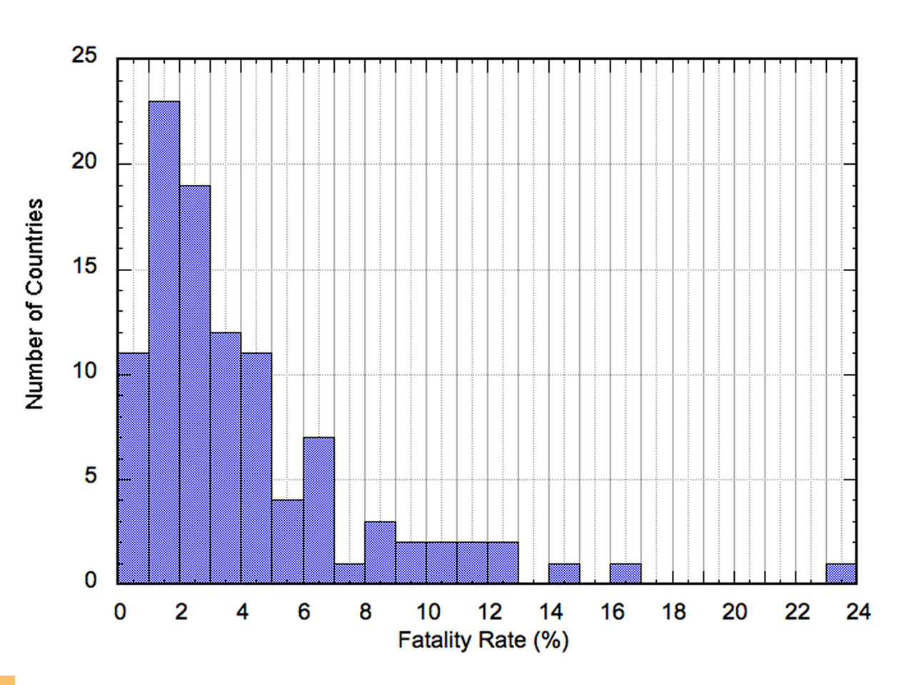
Figure 1. Histogram of fatality rates (%) for the countries listed in the JHU data.
The problem with trying to analyse the coronavirus data is that the figures from each country are all undoubtably biased in different ways. The reported number of confirmed cases in each country clearly depends on the testing regime used. I’ve made the assumption that the number of deaths in each country is a more reliable figure, but even that depends on, for example, whether deaths outside hospitals are counted to a greater or lesser degree. Defining the fatality rate as the number of reported deaths as a fraction of the number of confirmed cases, then the histogram, shown in Figure 1, peaks at about 1.5%.
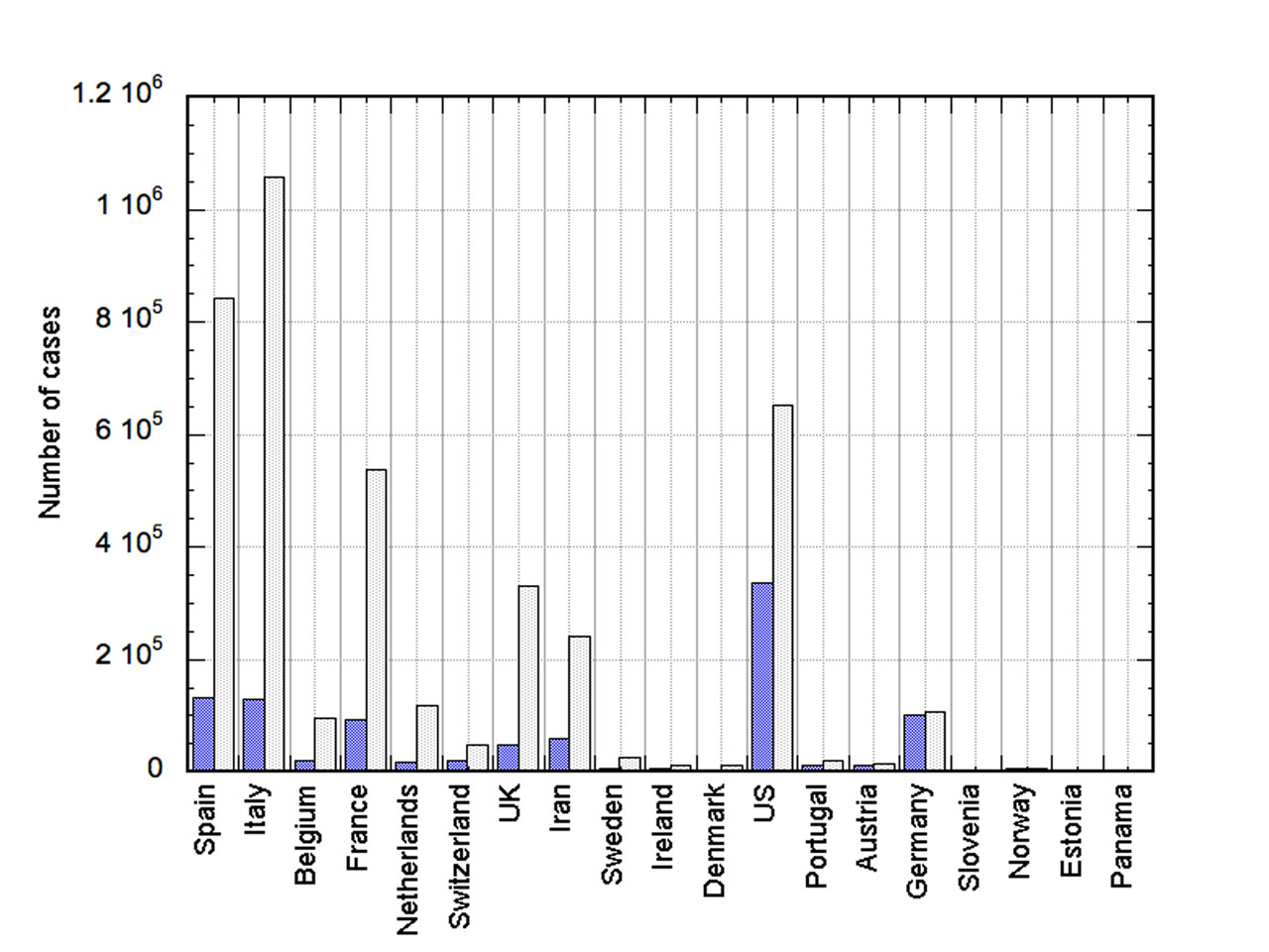
Figure 2. Reported number of confirmed cases, blue, and calculated actual number of cases in the population (grey).
If we assume 1.5% is the true fatality rate for this virus, then, assuming that the reported fatality rate is correct, one can calculate the actual number of cases in the population. This is shown in Figure 2 for the 20 most infected countries on the basis of the number of reported cases per 100K of the countries population. Only countries with populations over 1 million have been counted in this analysis.
The various assumptions used in plotting Figure 2 may well be wrong. However if they are correct, it suggests that the incidence of infection in the population for a number of countries is significantly higher than the testing shows. Thus for the UK, the number of reported, confirmed cases in this data set was about 48,400 whereas the calculated number of cases would be about 330,000.
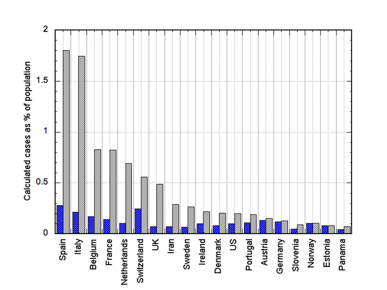
Figure 3. Reported percentage of the population infected and estimated true value assuming the true death rate is 1.5% (grey).
What this means is that for some countries a lot of people may be carrying the infection. The reported and the estimated true percentage of infected people in the population is shown in Figure 3. In the UK the estimated true number of cases is 0.5% of the population, in other words 1 in 200 of the people may be infected. However we know that the infection rate in London is higher than elsewhere, so in London even more of the people you meet will be infected, whereas elsewhere it will be less. Two hundred sounds a lot but it is surprising how many different people you will pass during a walk in a park.
Note that, by using the death rate and the country’s population to estimate cases, the most infected country is Spain rather than Italy. However Italy has been harder hit because, until recently, the infection has been confined to the northern region of the country, not spread though the population. In Figure 3, Spain and Italy stand out and these countries have certainly been badly infected. However the death rate in these countries may have been higher because it is more usual for grandparents to live with the family compared to in other European countries. That may have increased the death rate and hence the estimated number of cases will have been exaggerated compared to other countries. There are lots of potential errors in this analysis!

Figure 4. Number of tests conducted for each 100K of a countries population (blue) and the multiplication factor to convert reported case numbers into estimated true case numbers.
Does testing make a difference in the incidence of cases? In Figure 4 the amount by which the reported cases need to be multiplied to get my estimate of the number of cases is shown in grey. The number of tests conducted per 100K of the population is shown in blue. Switzerland and Panama, both relatively small countries, stand out as anomalies. Otherwise the Figure suggests that the more you test the more accurate your reported number of cases is likely to be. Not too surprising, but perhaps it also suggests that my estimate of the true number of cases is along the right track.
The UK and Iran show up as particularly poor at testing. The UK, Netherlands, France, and Belgium all have potentially many more cases than the number reported. However, a word of caution; the apparent inverse relationship between testing rate and ratio of true to reported cases did not hold up when countries other than the twenty most infected countries were considered.
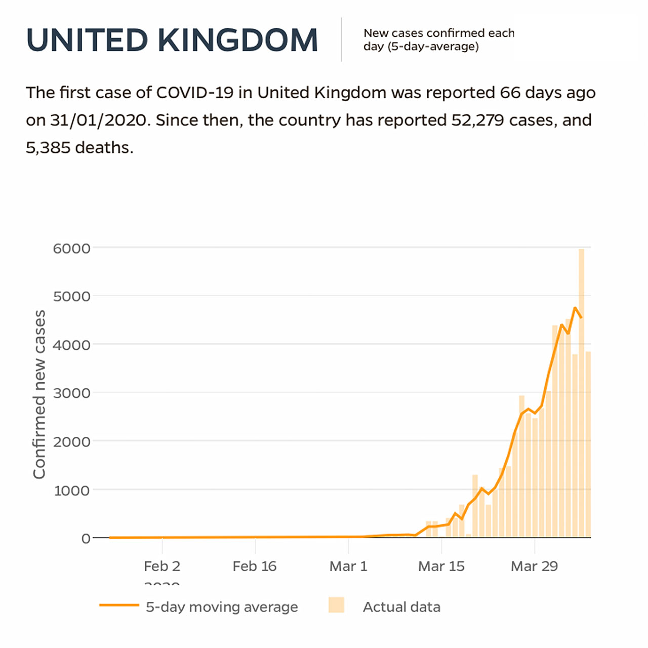
Figure 5. New cases in the UK from the JHU web site.
The day to day variation in new cases is analysed on the JHU web site which also presents a 5 day running average. In most of the countries analysed the rate of increase in new cases is leveling off but only in a few is it decreasing. As an example the plot for the UK (which includes data up to midnight on the 6th April) When viewing the graphs one must be careful to remember that if the number of new cases stops going up it still means that, for the UK, there are around 4000 reported new cases each day. Only when the number of new cases is zero can we hope that the epidemic is over.
Postscript: I finished this on the 7th April. Yesterday we were being told by Government Ministers that the PM had gone into hospital for “routine tests”. Now Prime Minister Boris Johnstone is now in an Intensive Care Unit. Will the politicians ever learn that if they want people to trust them they should tell the truth?